Sparkles the Dog | Branding, Content & Packaging
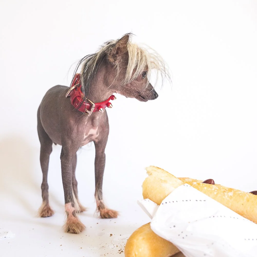
What better way to alleviate empty nest syndrome than with the acquisition of a four-legged friend? Sparkles the Dog gives you his full support.
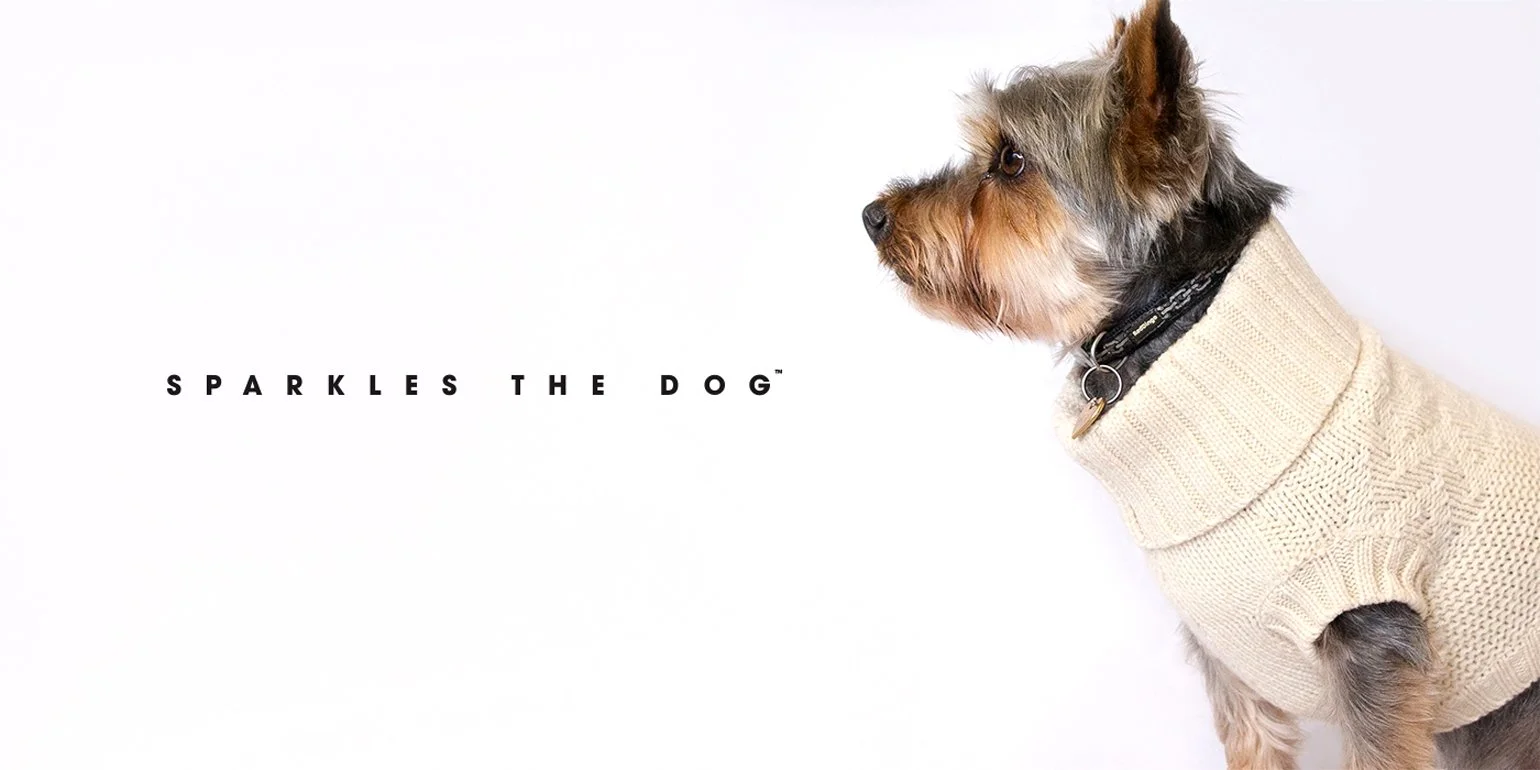
Offering a premium range of dog apparel, this niche brand has garnered mentions from Elle Macpherson, Cindy Crawford and Vogue Magazine, among others. An updated brand identity has been rolled out to coincide with a new accessory line, further enhancing the clean and elegant qualities of the brand.
Sparkles the Dog started from humble beginnings over a decade ago. Their niche range of dog apparel has since seen much success, but the brand has been slow to update their identity. As a new range of collars and leads are being added to their collection, it is essential to create a revised identity in order to stand out in this competitive market. I worked with the owner, Catherine Young, to create an updated brand identity and packaging for the new products. Having previously designed content and collateral for them, I was already accustomed to the brand. As their primary photographer, Tio Leota took photography duties once again.
As the brand was already well established, the project focused primarily on subtle aesthetic changes. Their eccentric photographs of dogs had been a strong marketing tool in the past so a simple and clean aesthetic was the preferred complement to this.
Initial logos were generated from this and grouped into three sub-categories: the simple, clean logo, the friendly mascot and the sophisticated mark.
The ultimate consensus was that most ideas compromised legibility or felt too busy. A few of the designs felt far too heavy and a clean type logo was the preferred option. This could fit the same lockup as the original logo, keeping an element of familiarity and allowing a simpler overhaul. This could allow a mascot-style mark to go along with the otherwise sophisticated feeling logo. The next step was to iterate the silhouette mark to increase the personal and personable elements of the logo.
After more experimentation, we believed it may be more beneficial to exemplify one look rather than trying to merge two. The silhouette logo created a conflicting set of values to the otherwise clean type logo. We therefore made the silhouette redundant.
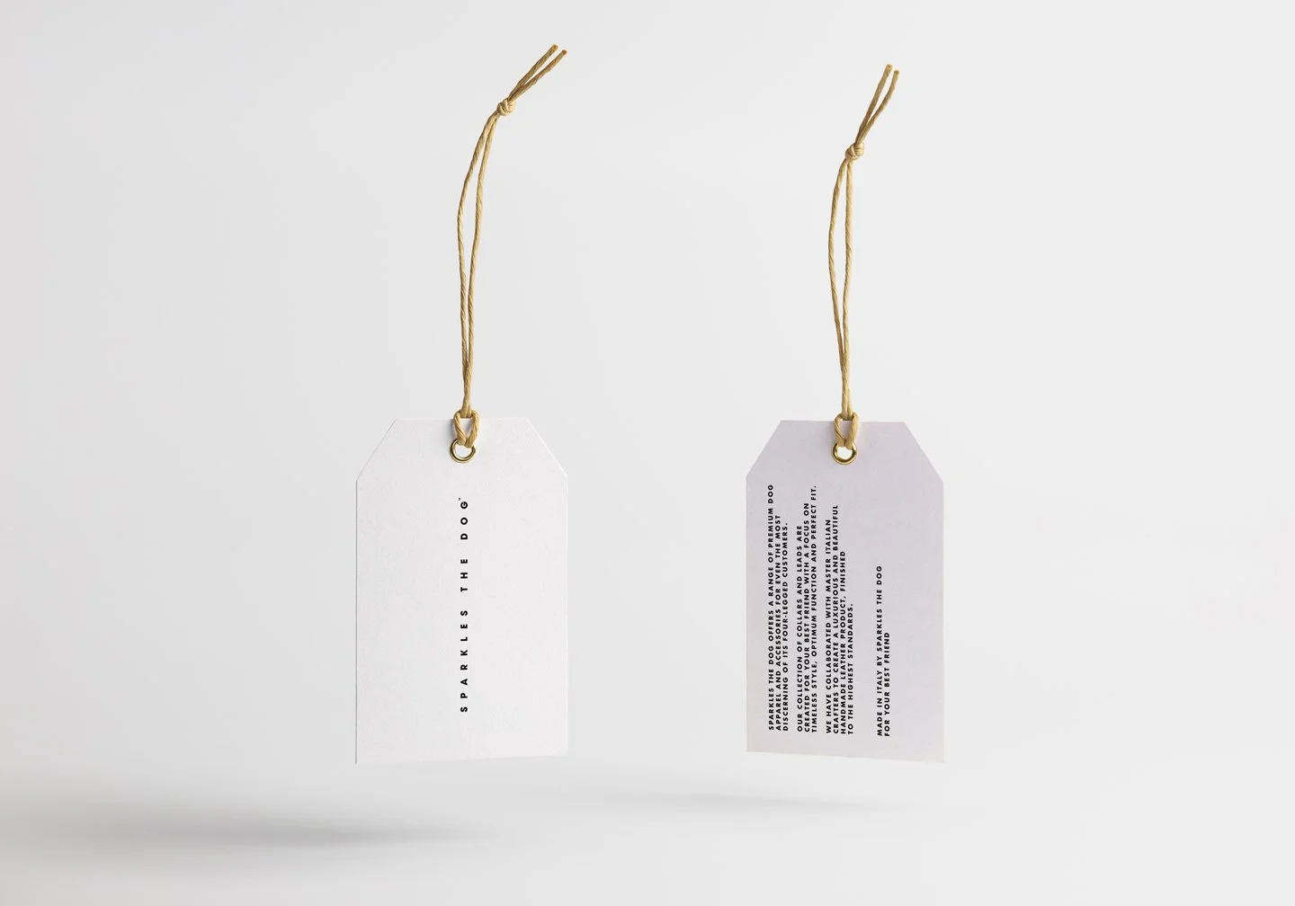
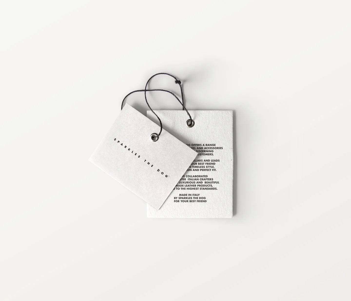
After settling on the logo, an overall aesthetic could be translated onto printed materials. A major consideration was the mode of sale. The brand generates an exclusivity through not being available in stores so much of the print required on conventional packaging could be bypassed. A swing tag would ideally serve as the key informative element. Several different options were mocked up for consideration.
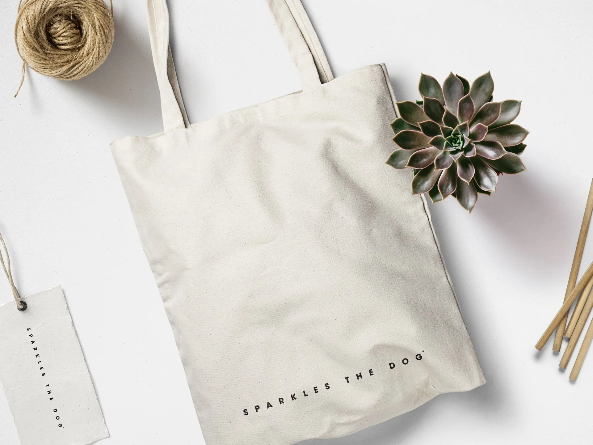
The products had previously been sent in a simple fabric drawstring bag. This became the preferred method of packaging as it would retain familiarity and allow a more gradual rollout of the complete collateral. It would also save on unnecessary costs and efforts to find new packaging production methods. The brand had a simple monotonous colour scheme and this was ultimately kept also for familiarity.
The dog photography continued to be the major driving force for the brand. The new identity was implemented with minimal change to other areas, the logo could be easily dropped onto the same lockups—namely the new packaging. A wrapping paper was added to the core packaging with a repeated logo overlay, and loyalty cards continued to be printed to offer discounts to loyal customers.
The collars and leads were released through a social media campaign of modelled phtographs. Marketing was focused on the products rather than the brand, and subsequently featured on various high-end publications including Vogue Japan and Town and Country Magazine UK. The updated identity was crucial in capturing this new international audience.
